Unified BackOffice
How I built a no-code system that empowered teams, cut operational waste, and improved collaboration between the employees who provide self-service content for their customers.
1. Overview
🍕 Imagine a customer orders a pizza online and sees the status 'Order delayed' after 30 minutes.
Their first reaction might be to ask why, cancel for a refund, give feedback, or continue waiting. It's impractical to have human support handle all such cases, so a self-service content system is provided through a tool called Help Center (HC).
For issues like missing or wrong items, customers receive compensation calculated by Auto Compensation (AC). Fraudulent claims are handled through Exploit.
The three different BackOffice tools—Help Center (HC), AutoComp (AC), and Exploit— address different issues, but users struggle to collaborate due to tool inefficiencies.
🚨 The result? Slow resolution times, higher operational costs, and frustrated employees who manage these systems.
As a Lead Designer working on this project, I took on the challenge of redesigning the back-office experience from the ground up.

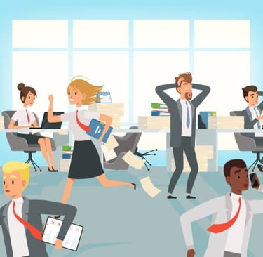
💬 “I have to switch between three tools just to process a single refund.” – Compensation Manager
💬 “If an automation fails, I have no idea why. I just guess and hope for the best.” – Fraud Analyst
2. How Does the Current Ecosystem Work?
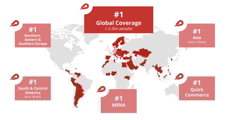
🌍 The company operates across 70+ countries in 4 continents. Here the operation is handled under different brands called as local teams. They have the full control over the business decisions based on the local conditions and customer support independently.
The central team provides knowledge and solutions to local teams (spokes) across regions. Each local team in each region uses the three back-office tools to build the self-service operations and a variety of other tools required to make independent business decisions.
3.The problem - existing systems
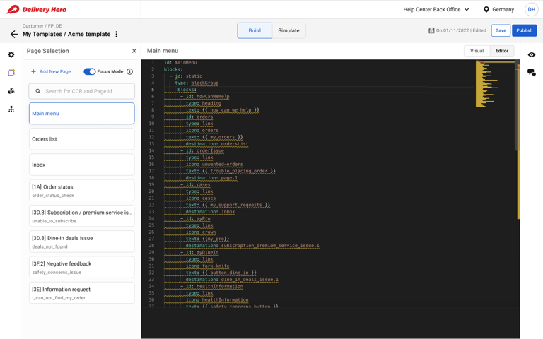
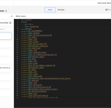
🖼️ Image: Help Center BackOffice
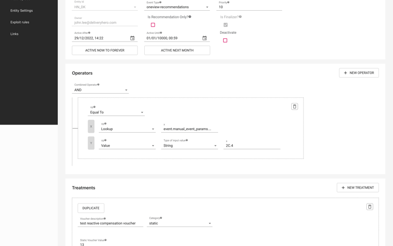
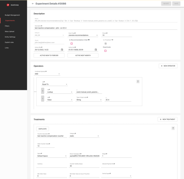
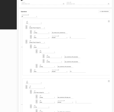
🖼️ Image: Autocomp BackOffice
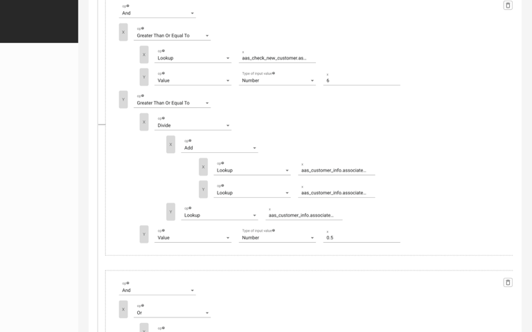
🖼️ Image: Exploit BackOffice
🛑 A fragmented user experience – Every BackOffice had a different UI, navigation, and workflow, making it difficult for users to intuitively understand other tools when switching context.
🛑 Collaboration bottlenecks – If a specialist needed to make a change, they had to email, set up meetings, and manually align teams—instead of doing it within the tool.
🛑 A high learning curve – Users had to memorize complex rules just to do basic tasks. Managing multiple, independent systems placed a significant strain on engineering resources for maintenance and updates.
🚨 The workflows were chaotic: Each function—Help Center (HC), AutoCompensation (AC), and Exploit—ran on separate systems, built at different times, by different teams.
💡 Why This Was a Critical Business Problem
1️⃣ Inefficient & lack of reusable code – Engineering teams had to build each BackOffice separately, despite similar conditions.
2️⃣ Slow resolution times – Customer Experience teams had to set up meetings with engineers just to review YAML updates.
3️⃣ Lack of visibility – Teams couldn’t see how their decisions affected other parts of the customer journey, leading to inconsistencies in refunds and fraud prevention.
🚀 Leadership set an aggressive goal: Reduce contact rates to 1% and make support workflows fully self-service. But the current tools couldn’t support this.
That’s where I came in. I needed to design a single, unified BackOffice that simplified workflows and reduced engineering dependency.
4. My Role, Responsibilities & Design Approach
👥 As the lead designer, I was responsible for the end-to-end design process—from problem discovery to final implementation.
My Key Contributions:
🔹 User Research & Discovery – Conducted 15+ interviews, synthesized insights, and mapped pain points.
🔹 UX Strategy & Vision – Defined the core principles for a no-code, unified BackOffice.
🔹 Information Architecture & Wireframing – Restructured workflows for clarity and efficiency.
🔹 Prototyping & Usability Testing – Ran three rounds of testing with real users.
🔹 Stakeholder Collaboration – Worked cross-functionally with PMs, engineers, and operations teams to align on feasibility.
4.1 My Design Process
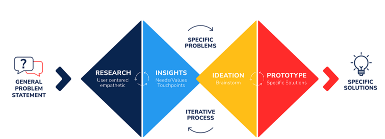
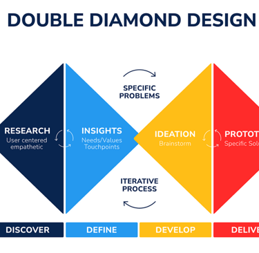
🛠 Double Diamond Approach:
1️⃣ Discovery – Research, user interviews, journey mapping
2️⃣ Definition – Prioritization of key problems, stakeholder alignment
3️⃣ Ideation – Sketching, wireframing, user flow mapping
4️⃣ Implementation – Prototyping, usability testing, iterative improvements
4.2 Success Measures
📊 Key Metrics:
✔ 70% satisfaction score in onboarding feedback surveys.
✔ 40% reduction in template creation time.
✔ 30% improvement in template success rate across 80% of use cases.
✔ 50% adoption rate within six months.
✔ 20% revenue increase within the first year.
✔ Achieve an NPS of 70+.
5. Discovery Outcomes
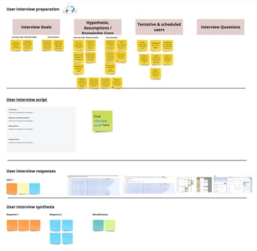
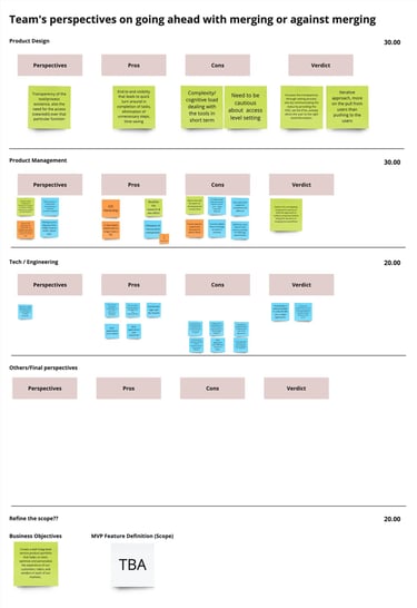
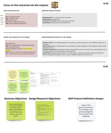
To understand the root problems, I conducted a workshop and aligned with key stakeholders.
👥 Stakeholder Interviews: To understand where to focus
🎯 Common Objectives & Goals: Set the foundation for discovery
🎤15+ Deep-Dive User Interviews: Engaged with Template authors, application support agents, fraud analysts, and CX professionals
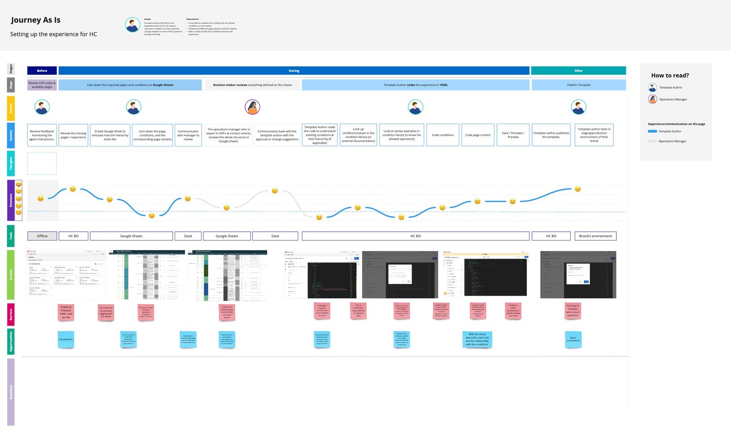
👣 User Journey Maps: Captured current states and opportunities
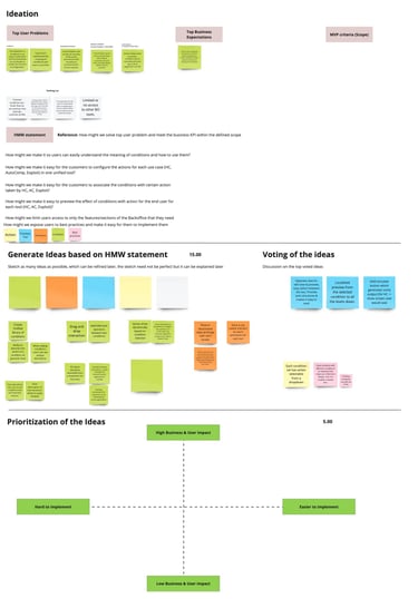
💡Ideation Workshop: Transformed problems and opportunities into feasible solutions
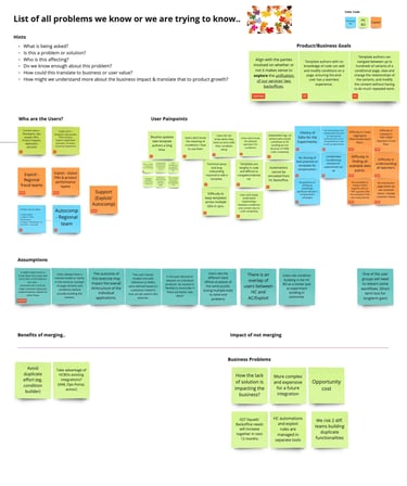
5.1 Key User Problems
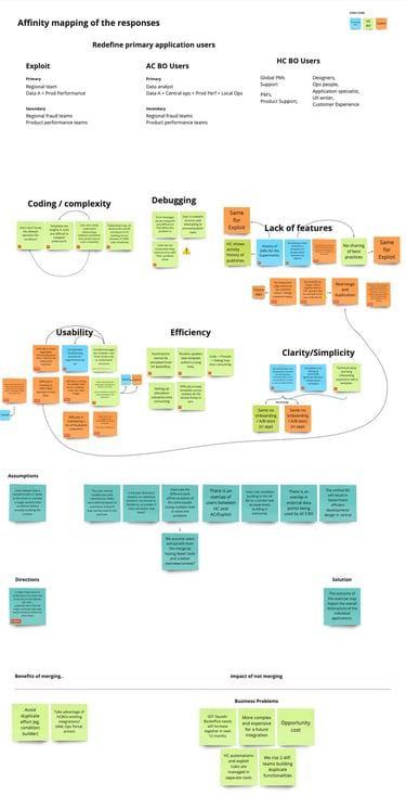
Synthesizing Workshop Outcomes into Actionable Insights
My analysis of user research reports and stakeholder feedback revealed several key challenges:
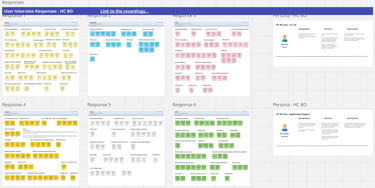
🔴 Time-Consuming Updates & Inconsistency: Routine template updates were lengthy and inconsistent across regions, causing delays and frustration. This was mainly due to the YAML coding platform for the Help Center BackOffice and a heavy reliance on technical support teams for experiments in AutoComp and Exploit BackOffices. The lack of a no-code platform exacerbated this issue.
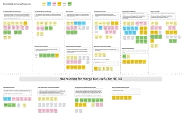
🔴 Complexity & Non-Standardized Conditions: Users struggled with the complexity of conditions and filters, and the lack of standardization across systems. The condition approach was common across all three BackOffices, but the creation, viewing, and updating processes differed, making cross-platform expertise difficult. Multiple levels of conditions further complicated understanding, even for specialists.
🔴 Navigation & Discoverability Issues: The complexity of navigating systems and finding relevant features hindered productivity.
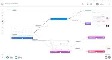
🔴 Inefficient Debugging & Error Handling: Debugging was frustrating due to unclear error messages and delayed awareness.
🔴 Onboarding & Usability Barriers: The technical complexity and lack of guidance made onboarding difficult, especially for less technical users.
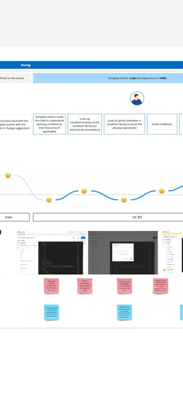
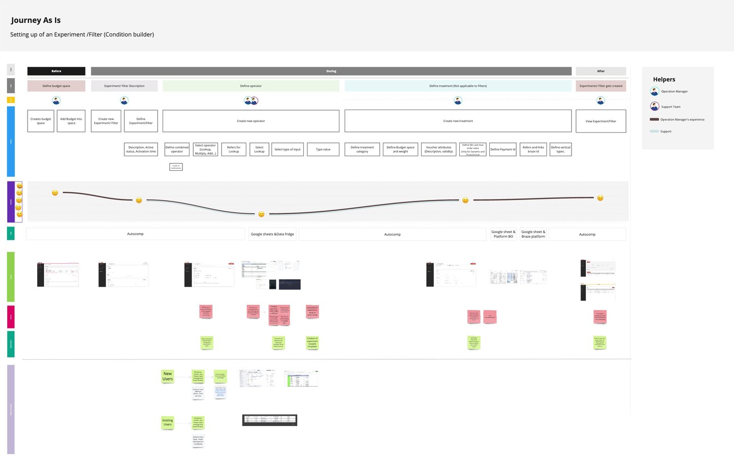
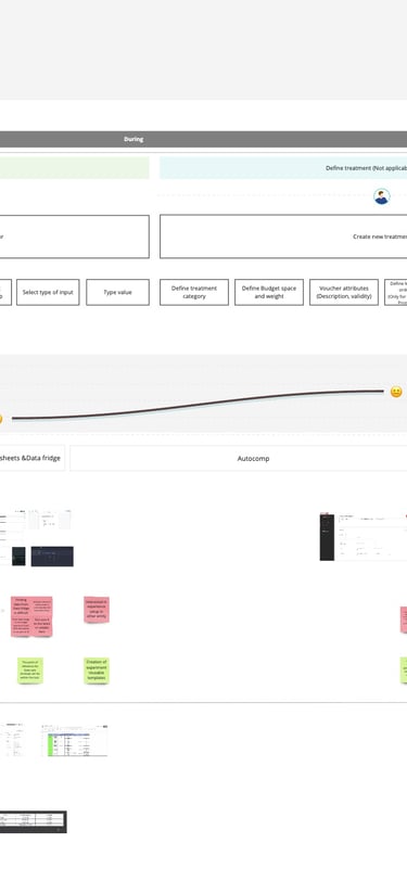
5.2 Journey Maps
Journey map - Help Center BackOffice
Journey map - Autocomp and Exploit


6. Solution Ideation & Execution
6.1 HMW Solution Generation
I collaborated with Product Managers to align on business objectives:
✔️ 40% faster template creation
✔️ 30% higher template success in 80% of scenarios
✔️ 50% adoption rate within six months
Key problems were prioritized, and the two most compelling were addressed in the initial solutions workshop:
1️⃣ How might we create a unified interface for all three BackOffices?
2️⃣ How might we simplify condition viewing and ensure consistent condition building across all three BackOffices?
Following the workshop, I led further design ideation, focusing on a no-code Unified BackOffice platform. My design evolved through several iterations.

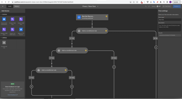
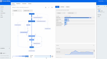
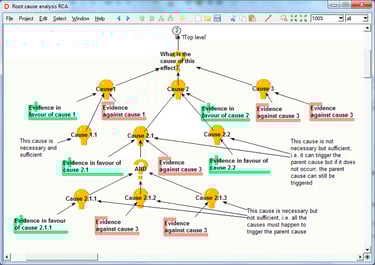
6.2 User Flows: Mapping
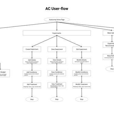
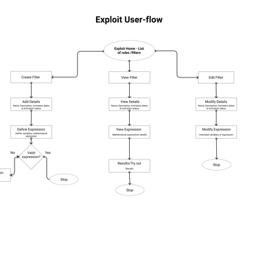
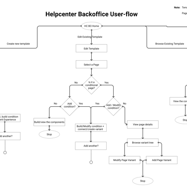
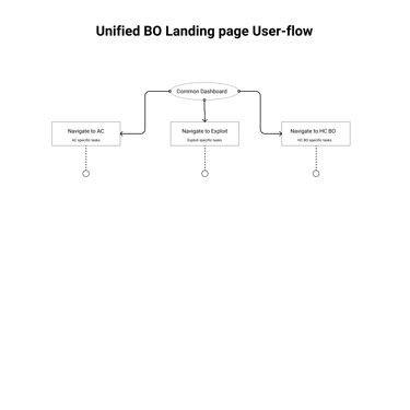
I designed user flows to map key workflows in the Unified BackOffice, focusing on:
✔️ Streamlining tasks to ensure smooth user journeys
✔️ Identifying & eliminating workflow bottlenecks
✔️ Ensuring task efficiency by creating a logical interaction sequence



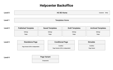
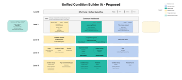
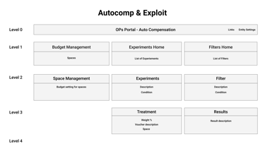
6.3 Information Architecture
A clear and logical IA was essential for the Unified BackOffice design. Key considerations included:
🔹 Centralized Access: Logical feature categories accessible from the main dashboard
🔹 Intuitive Navigation: Clear, consistent, and user-friendly labels and menus
🔹 Prioritization of Frequent Tasks: Making frequently used features prominent
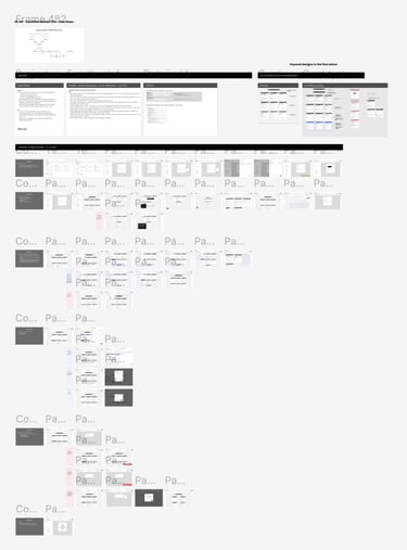
🖼️ Images: Information architecture diagram
🖼️ Images: User flow diagrams
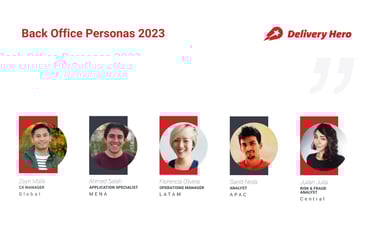
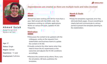
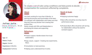
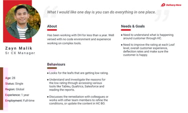
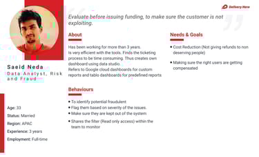
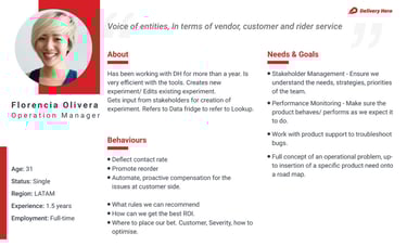


🖼️ Images: User personas


6.4 Personas
🖼️ Images: Design inspirations
Wireframing established the platform's structure before visual details. Through wireframes, I:
📌 Determined optimal placement of elements
📌 Experimented with interaction patterns & navigation
📌 Created low-fidelity representations for quick feedback
Iteration 1:
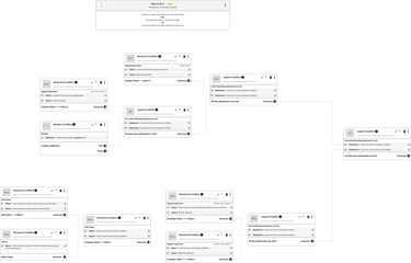
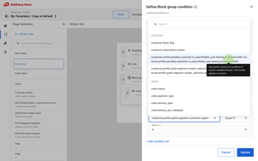
I analyzed existing condition elements to establish a reusable structure across all three BackOffices.
⚠️ Challenges: Exploit later shifted to mathematical expressions and Boolean values, differing from Help Center and AutoComp patterns.
✔️ My Approach: I focused on common elements: condition & operator (with optional values).
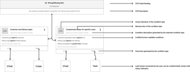
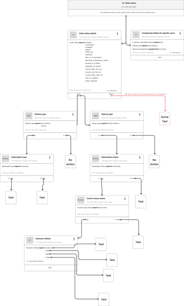
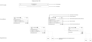
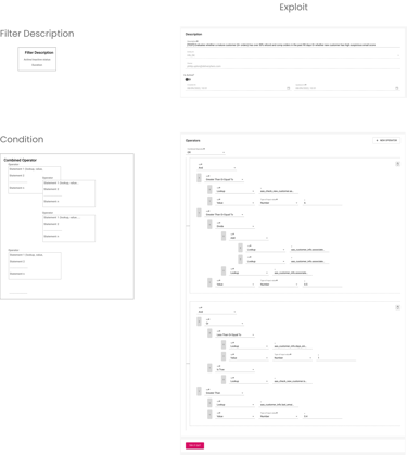
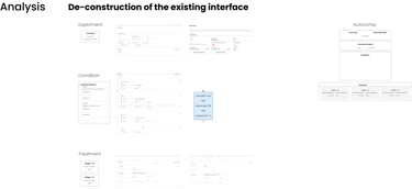
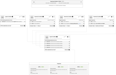
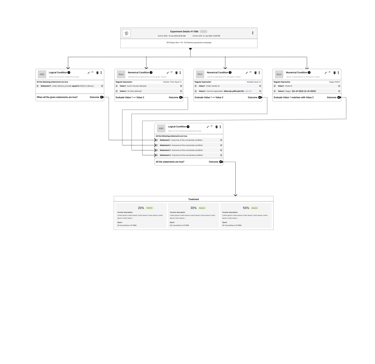
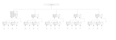


🖼️ Images: Understanding and re-aligning condition structures
6.5 Crafting an Intuitive User Experience
Iteration 2:
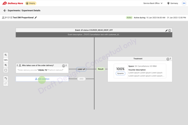
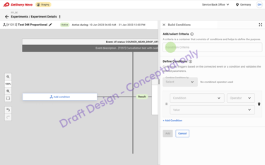
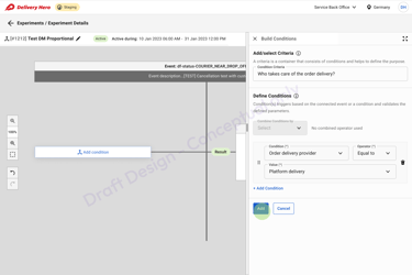
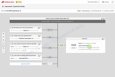
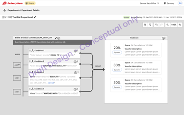
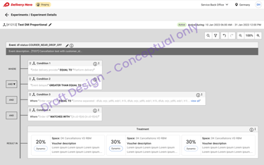
Explored a canvas approach for a more manageable condition interface.
⚠️ Challenges: Excessive scrolling in AutoComp, no visual interface in Help Center.
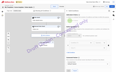
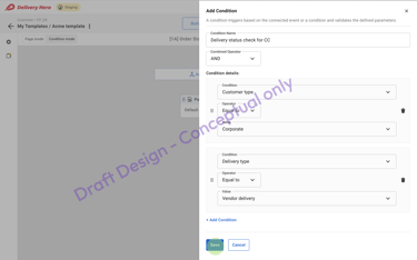
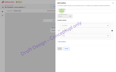
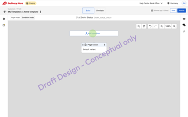
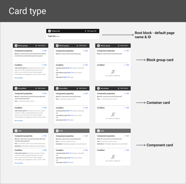
✔️ My Approach: A zoomable canvas with top-down segmentation for Help Center and left-to-right expressions for AutoComp and Exploit.


Iteration 3: Unified BackOffice
With key elements addressed, I focused on creating a central access point for all BackOffices:
🔹 Simplified navigation & switching between platforms
🔹 Increased BackOffice visibility via dashboard
🔹 Common resource access for settings & onboarding
🔹 Customer traffic & metrics visualization (deferred post-MVP)
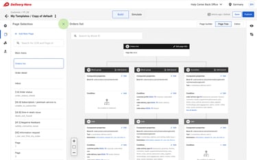
💡 Final Design: A no-code, drag-and-drop condition builder & centralized template library.
🔹 Outcome: A powerful and accessible platform for global support teams.
🖼️ Images: Autocomp BackOffice condition builder canvas
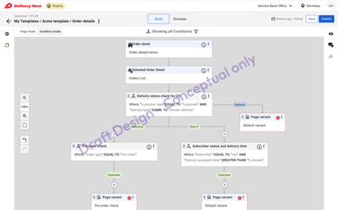
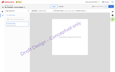
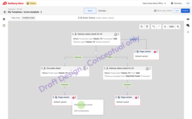
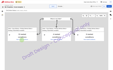
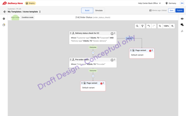
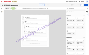


🖼️ Images: Help Center BackOffice condition builder canvas
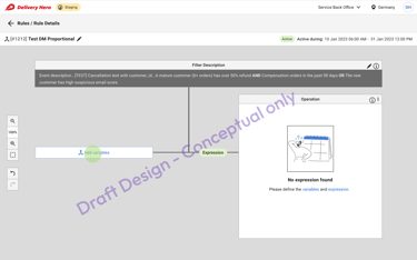
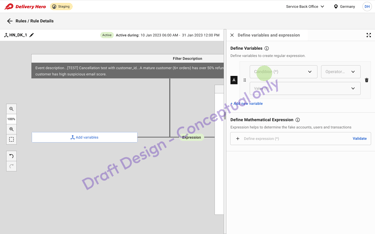
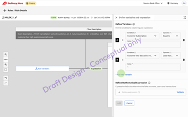
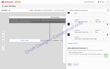
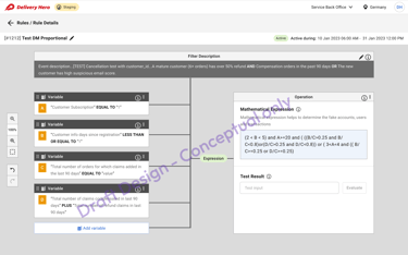
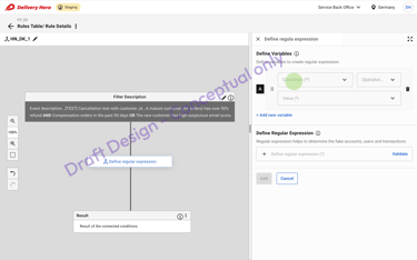


🖼️ Images: Exploit BackOffice condition builder canvas
The final interactive prototype showcased:
🎨 Polished UI: Refined elements, typography, and cohesive visuals
🖱️ Interactive Functionality: Showcased user interactions & workflows
✅ Tangible Solution: Facilitated stakeholder buy-in & feedback
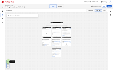
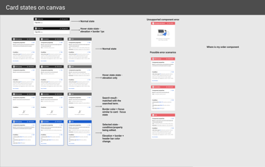
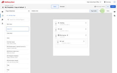
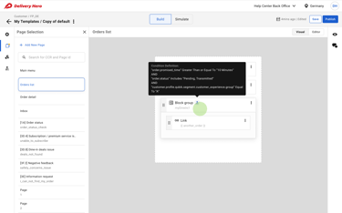
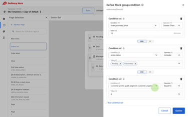


🖼️ Images: Help Center BackOffice High-fidelity mockup
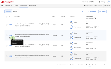
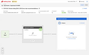
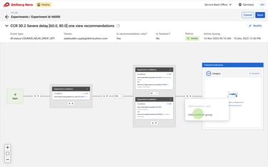
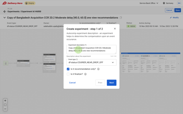
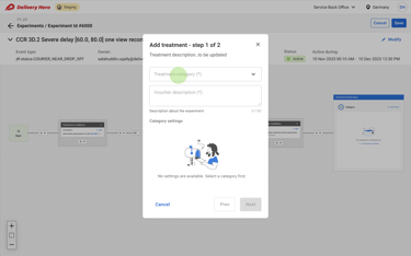
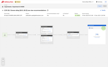
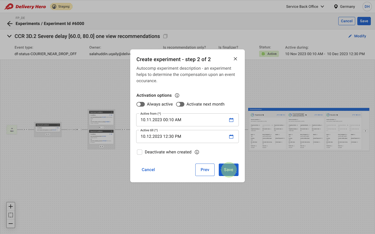
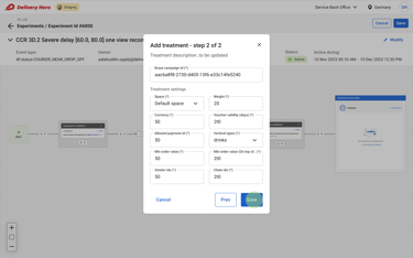
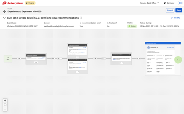
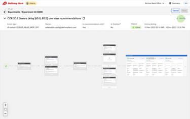
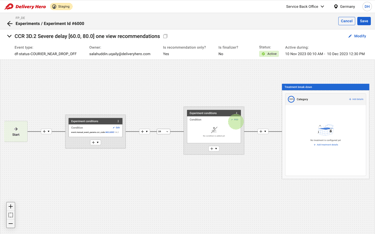
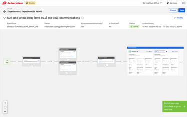
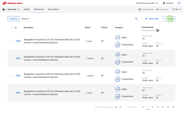
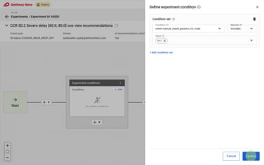
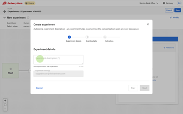
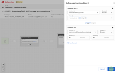
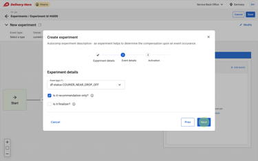
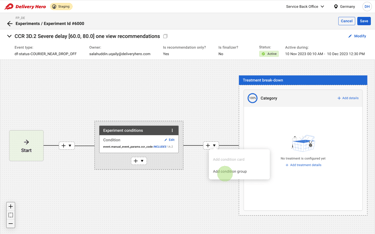
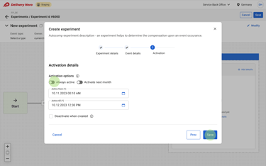
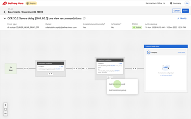


🖼️ Images: Autocomp BackOffice High-fidelity mockup
6.6 High-Fidelity Mockups & Prototype
7. Testing & Iteration: Making Sure It Worked
🔬 Usability testing with 10+ real users across different teams.
📈 Task-based performance tests measuring efficiency improvements.
Results from Testing:
✔ 40% faster workflow creation (compared to YAML-based setups).
✔ 35% decrease in debugging time (due to better visibility on errors).
✔ 70% adoption rate within six months of launch.
💡 “For the first time, I feel like I control my workflows.” – Compensation Manager
8. Final Impact: How This Changed the Business
🏆 30% fewer support escalations → More issues resolved automatically.
🏆 Millions saved in engineering time → No more manual YAML updates.
🏆 Faster rollout of new workflows → Teams could launch rule changes in minutes, not weeks.
9. Key Learnings & Reflections
🔹 A no-code approach isn’t just a UI change—it transforms operational efficiency.
🔹 Debugging transparency was a game-changer—giving users control reduced frustration.
🔹 Scaling enterprise design means balancing flexibility with simplicity.
🚀 Next Steps: Expand this system to external partner integrations.
